
浅谈 CSS 中的 Grid 网格布局
前言
我在自己的仓库中已经简单聊过 Flex 布局,如有需要可以自取查看。由于这篇笔记只是简单地讲了讲参数和对应的设置,并没有系统地进行讲解,因此后续我也将会出一期关于 Flex 布局的教程,谈一谈自己的学习感悟和理解。
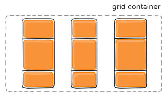
题归正传,本篇文章讲谈一谈另一种布局,即 Grid网格布局。Grid 布局与 Flex 布局有一定的相似性,都可以指定容器内部多个项目的位置。然而,它们也存在一些区别并适用于特定的应用场景。
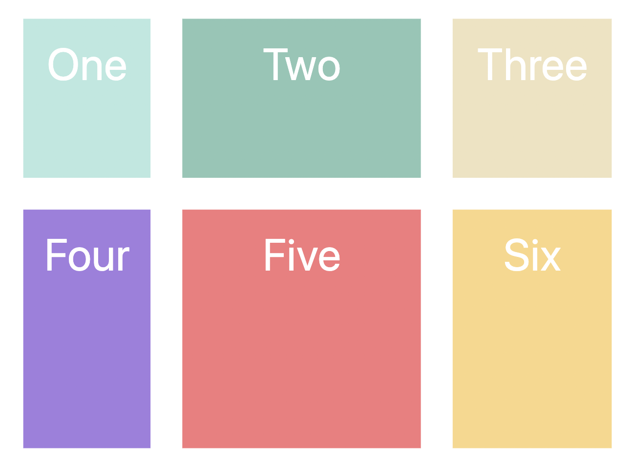
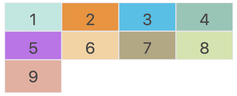
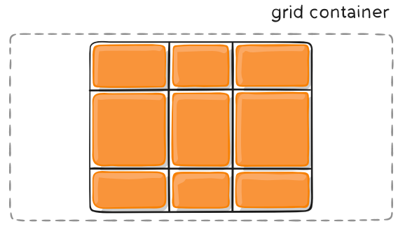
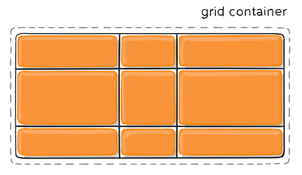
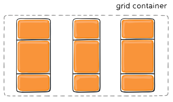
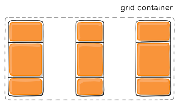
Flex 布局是一维布局,我们只能在一条线上或者说一个维度上,排布我们的子元素,而 Grid 布局则是将容器划分成 “行“ 和 “列“ ,类似于矩阵、格网,是二维布局。举个例子,如下:

概述
Grid 布局顾名思义,就是网格。提到网格,在我们生活中的应用场景就很多了,比如:菜单、用户属性表或一系列复杂的二维排布的内容。如果使用其他的布局,虽然也可以实现我们的需求,但是其过程可谓是十分复杂且繁琐的,并且可能存在 “适应性/灵活性不强” 的问题。然而,Grid 布局为我们提供了便捷,并且几乎可以用于所有的浏览器。
网格是由一系列单元格和分割线组成的,而单元格内容的定位,我们可以根据 “先行后列/先列后行”等顺序、网格线编号或行列号实现。
下面我将详细介绍 Grid 布局的相关属性及其对应参数。
基本属性
容器属性
Grid 布局的属性可分为容器属性和项目属性,前者确定格网整体一系列的设置,后者确定格网内部项目的设置。
display 属性
与其他布局类似,我们可以通过 display: grid 来指定容器采用网格布局。
1 | .mycontainter { |
网格布局的容器将会是块级元素,但如果我们想要设置为行内元素,可以设置为 display: inline-grid。
注意,设为网格布局以后,容器子元素的
float、display: inline-block、display: table-cell、vertical-align和column-*等属性都将失效。
grid-template-columns / rows 属性
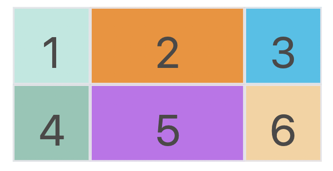
当我们通过 display: grid 设定布局后,我们就需要对其内部的单元格进行大小设置。grid-template-columns 可以设置列方向(横向)上的长度,grid-template-rows 可以设置行方向(纵向)上的长度。我们设定的长度可以是固定值、百分比、关键字等等。下面以 2 x 3的网格 为例。
固定值
给行和列的宽度设定为固定不变的值。
1 | .mycontainter { |
百分比
给行和列的宽度设定为容器百分比的大小,可以根据不同屏幕大小显示不同大小。
1 | .mycontainter { |
repeat() 函数
repeat 关键字即重复的意思。有时候,重复写同样的值非常麻烦,尤其网格很多时。这时,可以使用 repeat() 函数,简化重复的值。上面的代码用 repeat() 改写如下。
1 | .mycontainer { |
repeat() 函数有两个参数,分别是:重复次数,长度值。
repeat()重复某种模式也是可以的。
1 | grid-template-columns: repeat(2, 100px 20px 80px); |
上面代码定义了6列,第一列和第四列的宽度为 100px,第二列和第五列为 20px,第三列和第六列为 80px。
auto-fill 关键字
有时候我们已知容器的长度,但没有设置子元素长度,并希望子元素能够尽可能的填充容器。那么我们就可以通过结合 repeat() 和 auto-fill 关键字来实现。
1 | .mycontainter { |
fr 关键字
为了方便表示比例关系,网格布局提供了 fr 关键字(fraction 的缩写,意为”片段”)。如果两列的宽度分别为1fr 和 2fr,就表示后者是前者的两倍。
1 | .mycontainter { |
minmax() 函数
我们也可以设置一个范围,即长度不小于某个值,不大于某个值。minmax() 函数产生一个长度范围,表示长度就在这个范围之中。它接受两个参数,分别为最小值和最大值。
1 | .mycontainter { |
auto 关键字
当我们一列有三个网格,我们设定好左右两个网格长度后,希望中间的网格自适应调整大小,那我们可以使用 auto 关键字实现,
1 | .mycontainter { |
grid-row-gap / grid-column-gap 属性
如果没有设定 gap 属性值,网格中的单元格都是紧凑排布,中间是没有间隙的。但在很多应用场景中,我们希望单元格间具有一定的间隙。因此,可以通过 grid-row-gap \ grid-column-gap \ grid-gap 属性实现。 grid-gap 是前两者合并简写形式,语法如下:
1 | .mycontainter { |
grid-auto-flow 属性
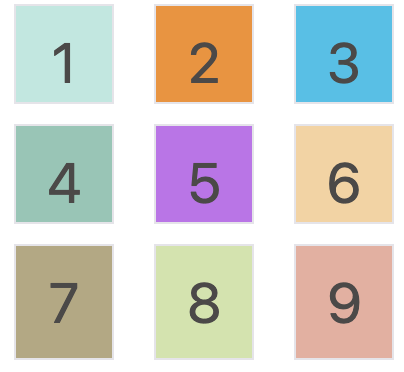
当我们不通过其他排布方式来排列单元格时,容器的子元素会按照顺序,自动放置在每一个网格。默认的放置顺序是”先行后列”,即先填满第一行,再开始放入第二行。
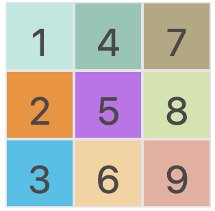
我们可以通过设置 grid-auto-flow: column 来让子元素 “先列后行”。
1 | .mycontainter { |
grid-template-areas 属性
有“先行后列”排序,也有“先列后行”排序,当然我们也可以通过设定区域,在后续让每个子项目决定自己属于哪个/哪些区域。
1 | .mycontainer { |
上面代码就是将一个 3 x 3 的网格内部的单元格标记为 a-i 区域,可用于后续项目属性。
划分也可以设定为:第一行是 a 区域,第二行是 b 区域,第三行是 c 区域。如下
1 | grid-template-areas: 'a a a' |
justify-items / align-items / place-items 属性
如果我们需要设置单元格内容(内部子元素)的对齐方式,我们可以通过 justify-items、align-items、 place-items 属性来设置。
justify-items 属性设置单元格内容的水平位置(左中右),align-items 属性设置单元格内容的垂直位置(上中下)。place-items 属性则是前两者的合并简写形式。
1 | .mycontainer { |
这两个属性的写法完全相同,都可以取下面这些值:
- start:对齐单元格的起始边缘。
- end:对齐单元格的结束边缘。
- center:单元格内部居中。
- stretch:拉伸,占满单元格的整个宽度(默认值)。
justify-content / align-items / place-items 属性
如果我们需要设置网格容器内部元素的对齐方式,我们可以通过 justify-content、align-content、 place-content 属性来设置。
justify-content 属性是整个内容区域在容器里面的水平位置(左中右),align-content属性是整个内容区域的垂直位置(上中下)。
1 | .mycontainer { |
这两个属性的写法完全相同,都可以取下面这些值:(以下内容引用阮一峰老师的教程)
- start: 对齐容器的起始边框。
- end: 对齐容器的结束边框。
- center: 容器内部居中。
- stretch: 项目大小没有指定时,拉伸占据整个网格容器。
- space-around: 每个项目两侧的间隔相等。所以,项目之间的间隔比项目与容器边框的间隔大一倍。
- space-between: 项目与项目的间隔相等,项目与容器边框之间没有间隔。
- space-evenly: 项目与项目的间隔相等,项目与容器边框之间也是同样长度的间隔。
项目属性
上面说的都是如何从格网容器这个宏观角度来调整样式,下面我们讲细谈一下项目属性,即格网容器内部每个 item 的属性设置。
grid-column-start / grid-column-end / grid-row-start / grid-row-end 属性
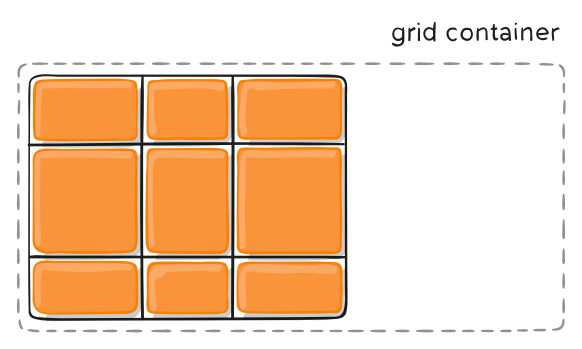
如果我们并不想按照 “先行后列” 或 “先列后行” 的顺序排布项目,而希望自由度更高一些,那我们就可以利用 grid-column-start、grid-column-end、grid-row-start、grid-row-end 属性按照网格线进行定位。比如:
1 | .item-1 { |
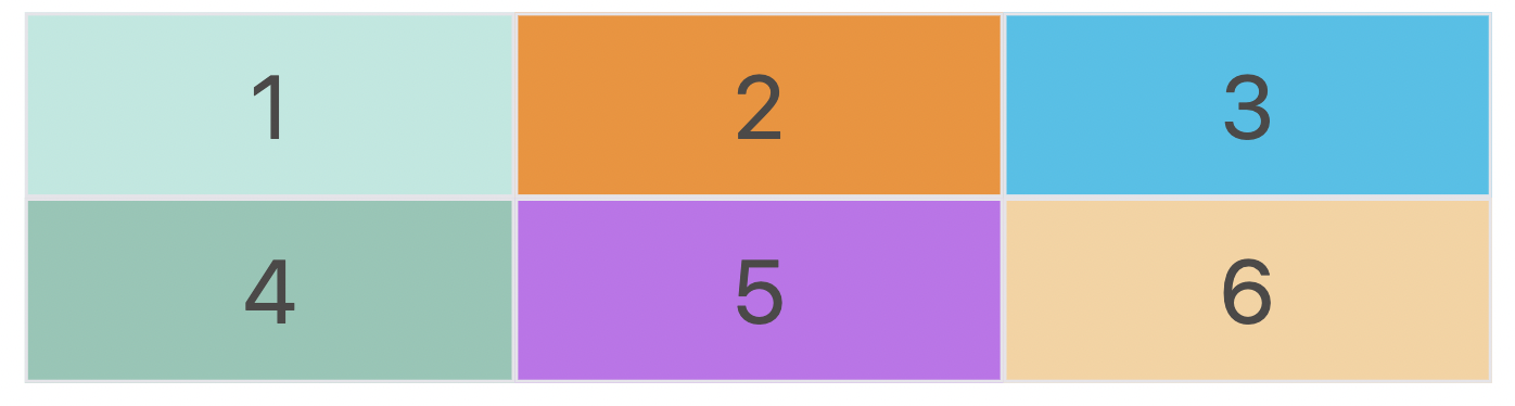
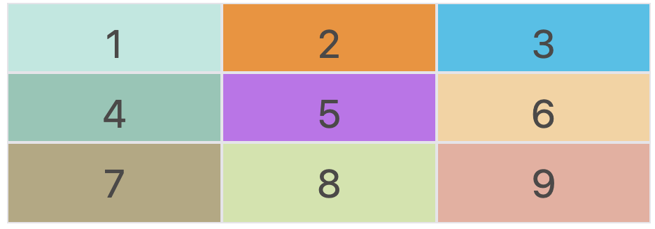
上面的 demo 就是定义:column 方向 第一条网格线开始到第三条网格线结束,row 方向 第一条网格线开始到第三条网格线结束的区域。如下图所示:
此外,我们除了用网格线的编号定位,还可以用网格线的名称,或
span关键字表示跨越来实现,这里不详细讲解,有需要可以自行搜索资料学习。
grid-column / grid-row 属性
上面的四个属性可以合并简写为两个属性,分别是 grid-column 和 grid-row。参数格式为:
1 | .item-1 { |
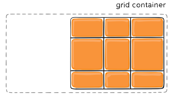
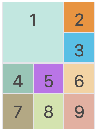
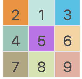
grid-area 属性
在容器属性中,我们提及到了 grid-template-areas 属性用于将网格分区。在项目属性中,我们可以利用 grid-area 属性根据区域编号对项目进行定位。
1 | .mycontainer { |
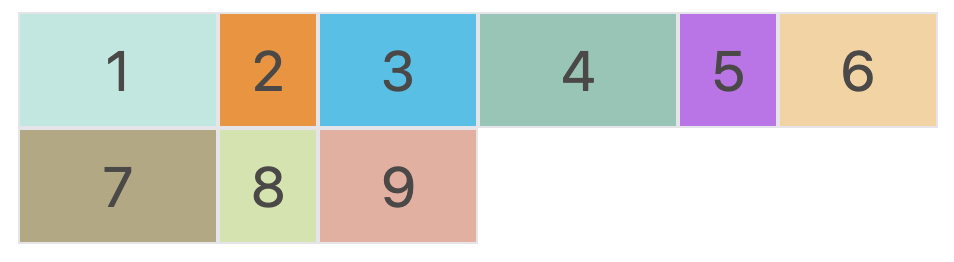
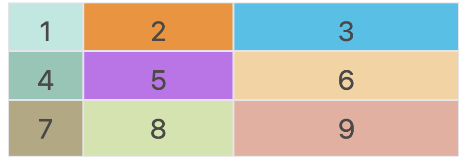
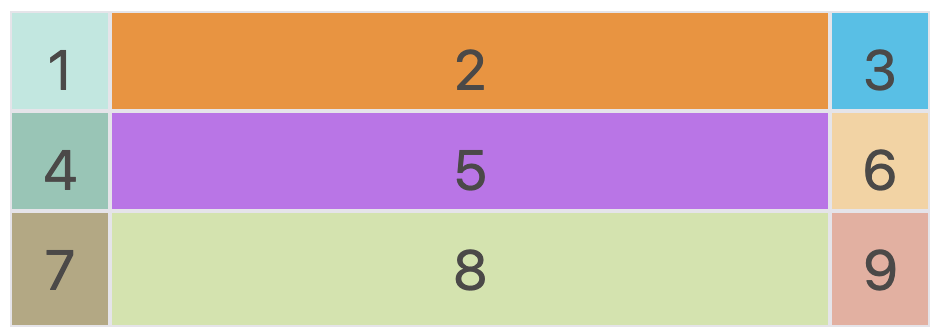
在上面的 demo 中,我们先将容器分成 a-i 九个区域,然后将 1 定位到了 b 的位置。效果如下图:
justify-self / align-self / place-self 属性
在容器属性中,我们提到如果需要设置单元格内容(内部子元素)的对齐方式,可以通过 justify-items、align-items、 place-items 属性来设置。
当然,我们也可以在项目属性中,针对每一个 item 设置各自的对齐方式,通过 justify-self、align-self、place-self (合并简写形式)属性实现。
1 | .item-1 { |
这两个属性都可以取下面四个值,
- start:对齐单元格的起始边缘。
- end:对齐单元格的结束边缘。
- center:单元格内部居中。
- stretch:拉伸,占满单元格的整个宽度(默认值)。
测试 Demo 代码(需要自取)
1 | <style> |
很感谢你能看到这里!谢谢~
参考资料: (衷心感谢各参考资料提供的帮助)
 微信
微信 支付宝
支付宝